White Labelling feature enables you to customize the system to align with the specific branding and identity requirements of your organization. This ensures that the application reflects your brand consistently across all platforms
Configuration Steps:
Organization Module Settings
To set up the White Labeling feature, navigate to the Organization module and locate the Settings section. Within the settings, find the White Labeling tab in the left-hand menu. Clicking on the White Labeling menu item will present you with two tabs: 1.Colors 2.Logos Colors Section The Colors section allows you to customize the primary and secondary colors, as well as text colors, for your organization. Here’s how you can do it:
Primary – 1: Select the primary color for your organization.
Primary – 2: Choose a secondary color to complement the primary color.
Text Color: Set the color used for text throughout the system.
Logos Section
The Logos section enables you to update the specific brand logo for your organization and includes options for uploading a favicon. Follow these steps:
Brand Logo: Upload the logo that best represents your organization.
Favicon: Add a favicon for optimal browser tab visibility and bookmark management.
Preview Changes
To ensure that your configurations are correct, click the Preview button. This will apply the configured White Labeling settings across the entire system. Once you are satisfied with the preview, proceed to finalize your changes.
Apply Changes
After reviewing and confirming the preview, Click the Apply Changes button to make the updates effective for your organization.
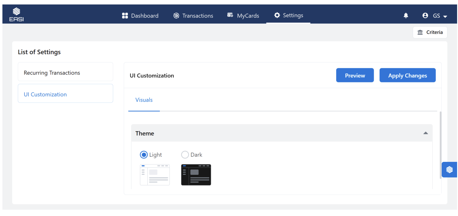
UI Customization:
The UI Customization feature allows you to personalize the system, enhancing the user experience according to individual preferences. This feature lets you configure and adjust various elements such as visualization options and component selections
Accessing UI Customization
For Administrators:
As an Admin you can configure the personalization of the system by following the below steps: 1.Navigate to the Organization Module. 2.Locate the settings tab and click on it . 3.In the left-hand menu, find and click on the UI Customization tab. 4.You will see two tabs:
Visual
UI Components
For Cardholders:
As a cardholder you will be able to access the Visual section and there only theme settings is available. 1.Navigate to the Settings Module. 2.Locate the settings tab in the main navigation tabs and click on it . 3.Only theme settings is available in visual Tab
Visualization Section:
In visual tab as an admin you can configure the below customization features
Theme Selection:
Choose between Light and Dark themes.
The Light theme is preselected by default. BreadCrumb styling: In breadcrumb styling you will be provided with two types of the breadcrumb styles Select from two breadcrumb styles:
/’: Separated by slashes
‘>’: Separated by greater-than symbols The ‘>’ style is selected by default
Toast Styling
Configure the position of toast notifications
Top Right
Bottom Right
Top Center
Status Tags Configuration
Select status indicators from the provided list to customize status tags within the system.
UI Components:
In UI components section you can be provided with two sections like Animations and Tool-tips:
Animations:
Choose from a list of spinner types to animate loading processes
Animations:
Choose from a list of spinner types to animate loading processes
Tooptips:
Select between the system’s default tooltip style or a custom tooltip style
Preview Changes
To ensure that your configurations are correct, click the Preview button. This will apply the configured UI Customization settings across the entire system. Once you are satisfied with the preview, proceed to finalize your changes.
Apply Changes
After reviewing and confirming the preview, Click the Apply Changes button to make the updates effective for your organization.